Monarca Cantina
An app for ordering Mexican food.
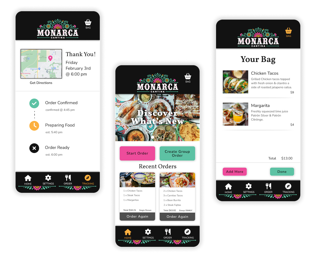
Challenge: Between collecting everyone’s order, adding each item to the cart, and double checking to make sure everything is correct, placing a group food order can take a lot of time which can be frustrating to people that are busy.
Solution: The Monarca Cantina app allows everyone in the group order to add their own food to the cart, which saves time and reduces the chance of someone getting the wrong order. Users can also schedule the order ahead of time to coordinate the pick up time with their busy schedule.
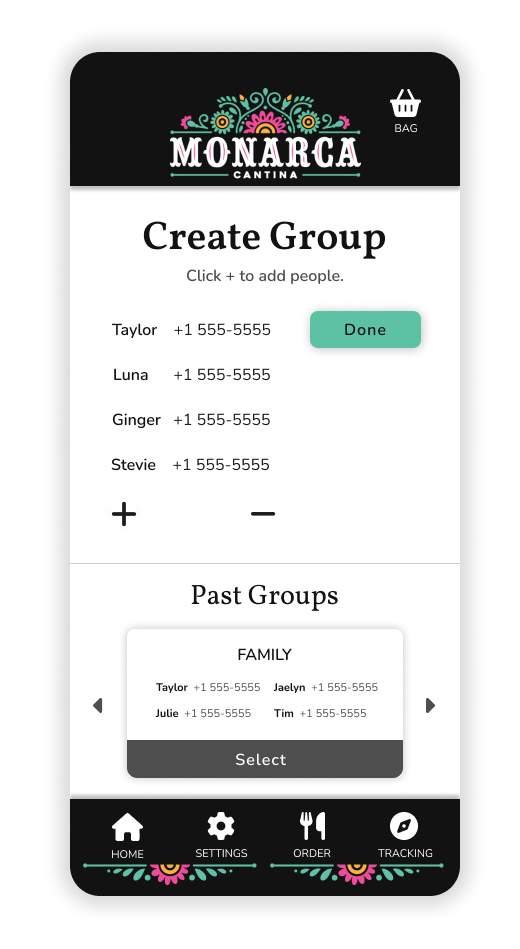
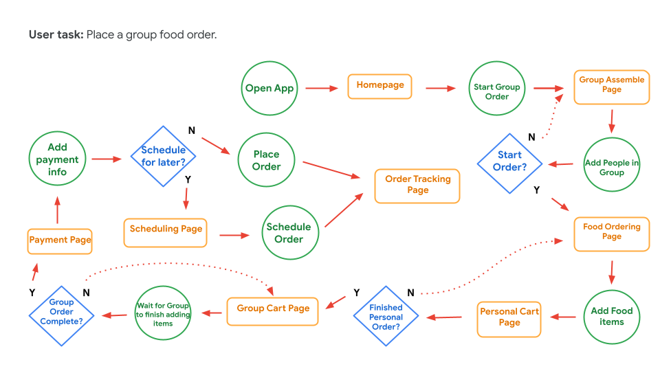
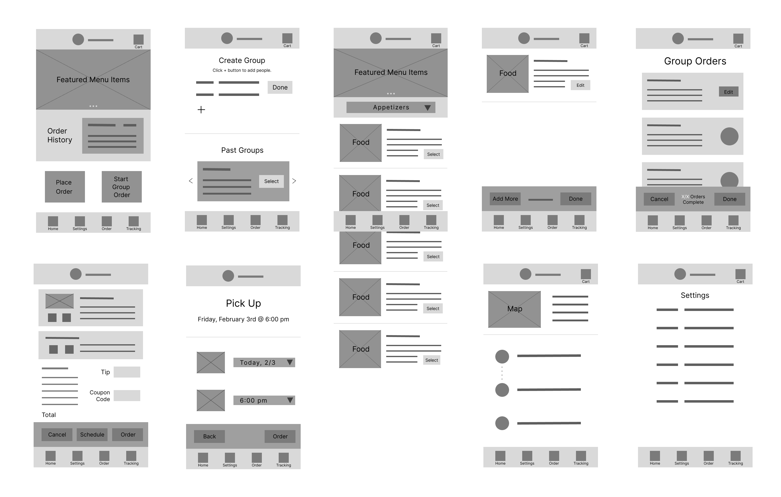
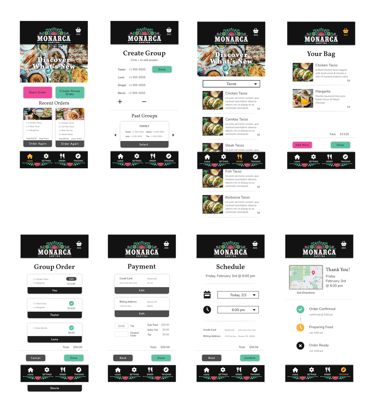
You can put together your group by adding everyone's phone numbers or easily choose from a group you've used in the past. Everyone in the group will be texted a link they can follow to add items from their own device.
After you've added your food to the order you can keep track of which people in your group have completed their orders and who you're still waiting for.
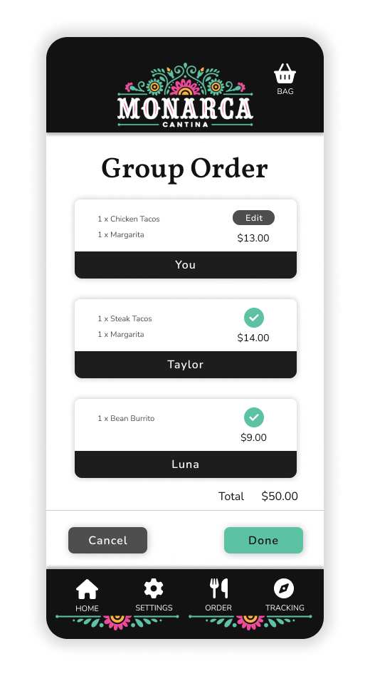
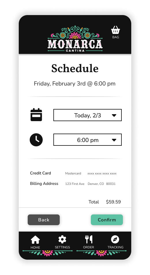
When everyone has finished adding their food to the order you can choose which day and time you want to pick it up.
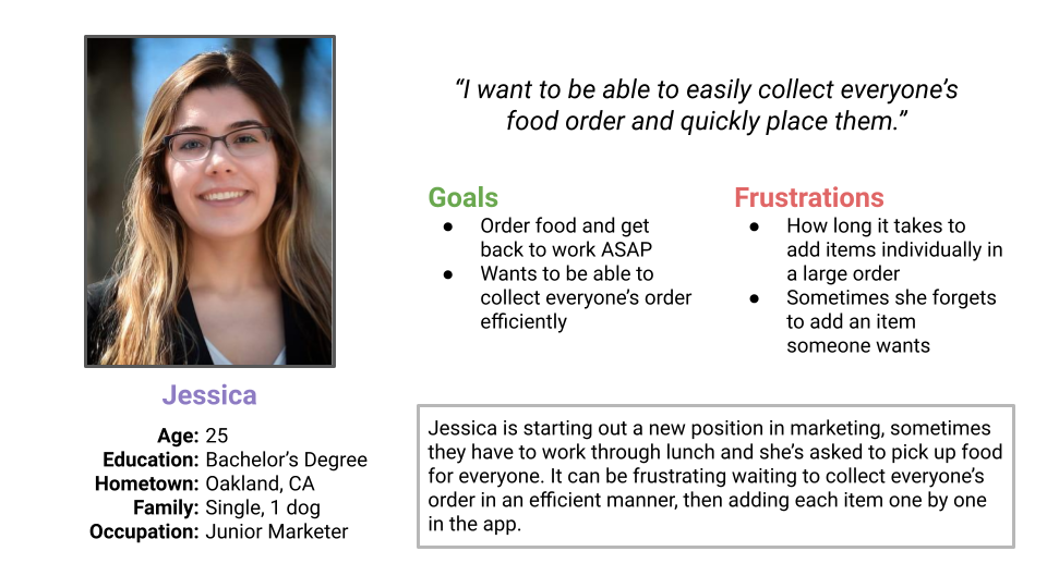
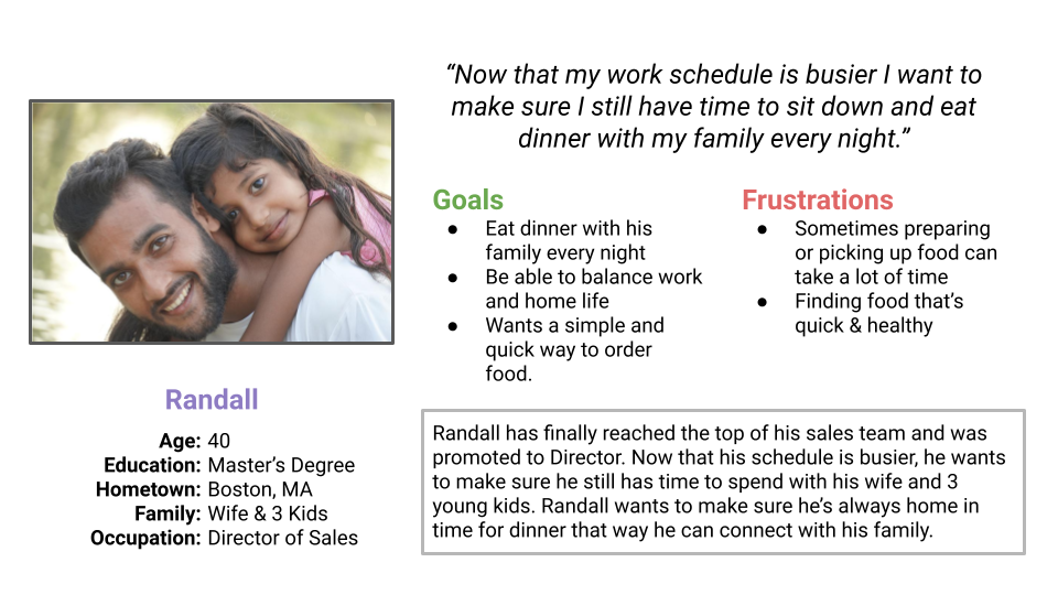
Personas
User Journey Map
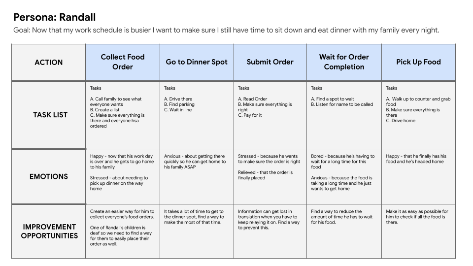
After performing user research it became clear that collecting everyone’s order and relaying that info to the restaurant is the most time consuming part of placing a group order. I also realized that it’s important to allow users to be able to choose what time they want to come pick up their food, that way they aren't always forced to place the order right before they go pick it up.
Competitive Audit



I performed a competitive audit on Chipotle, QDoba, Corona’s Mexican Grill, and Hacienda to figure out what they were doing well and what could be improved. Not surprisingly, Chipotle had the best user experience by far. I really appreciated all of the high quality images of food and how the information was laid out, it made me want to place an order.
User Flow
Sketching
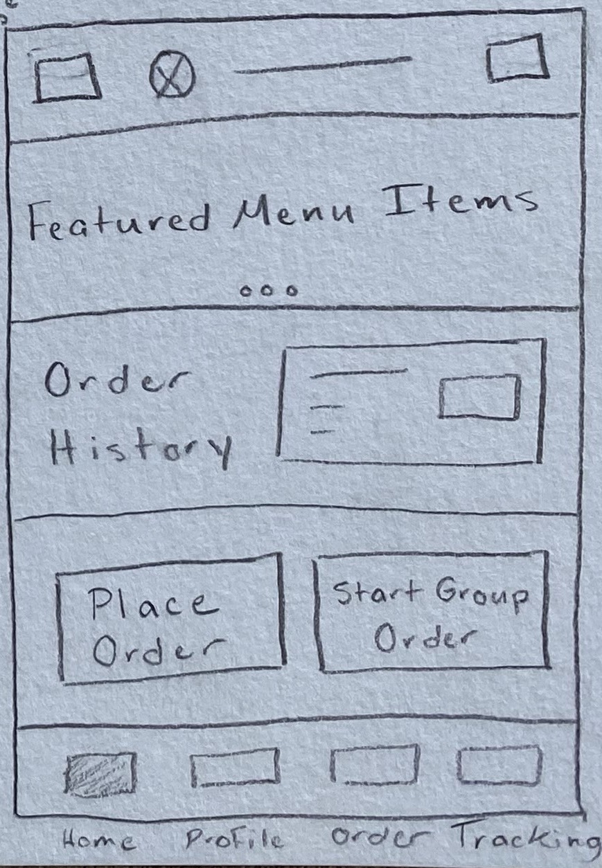
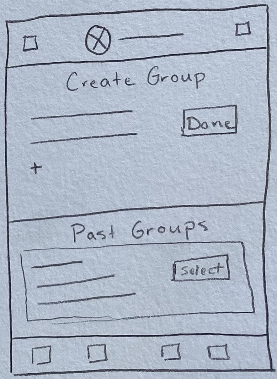
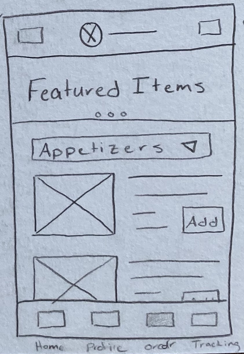
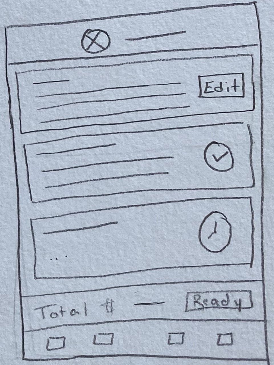
Wireframes
Usability Testing
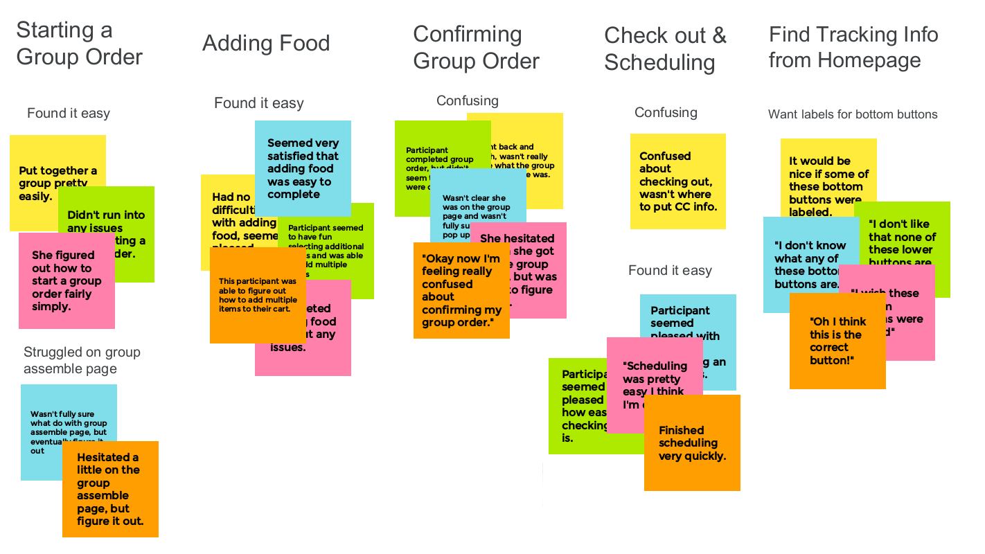
5 participants
23 to 65 years old
USA, unmoderated remote
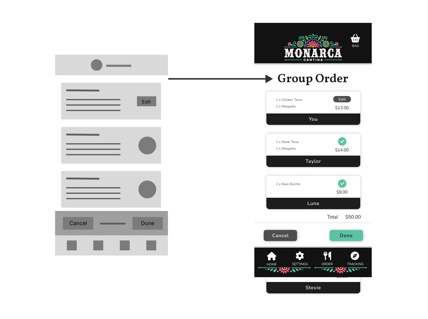
After performing user testing, I realized I didn’t add enough labels and my users were getting confused about what page they were on. I went back and added more labels throughout the app to make it more obvious what step of the process you were on. Below, you can see I added a label to the Group Orders page that way the users know they’re looking at the orders for everyone in their group.
Accessibility Considerations
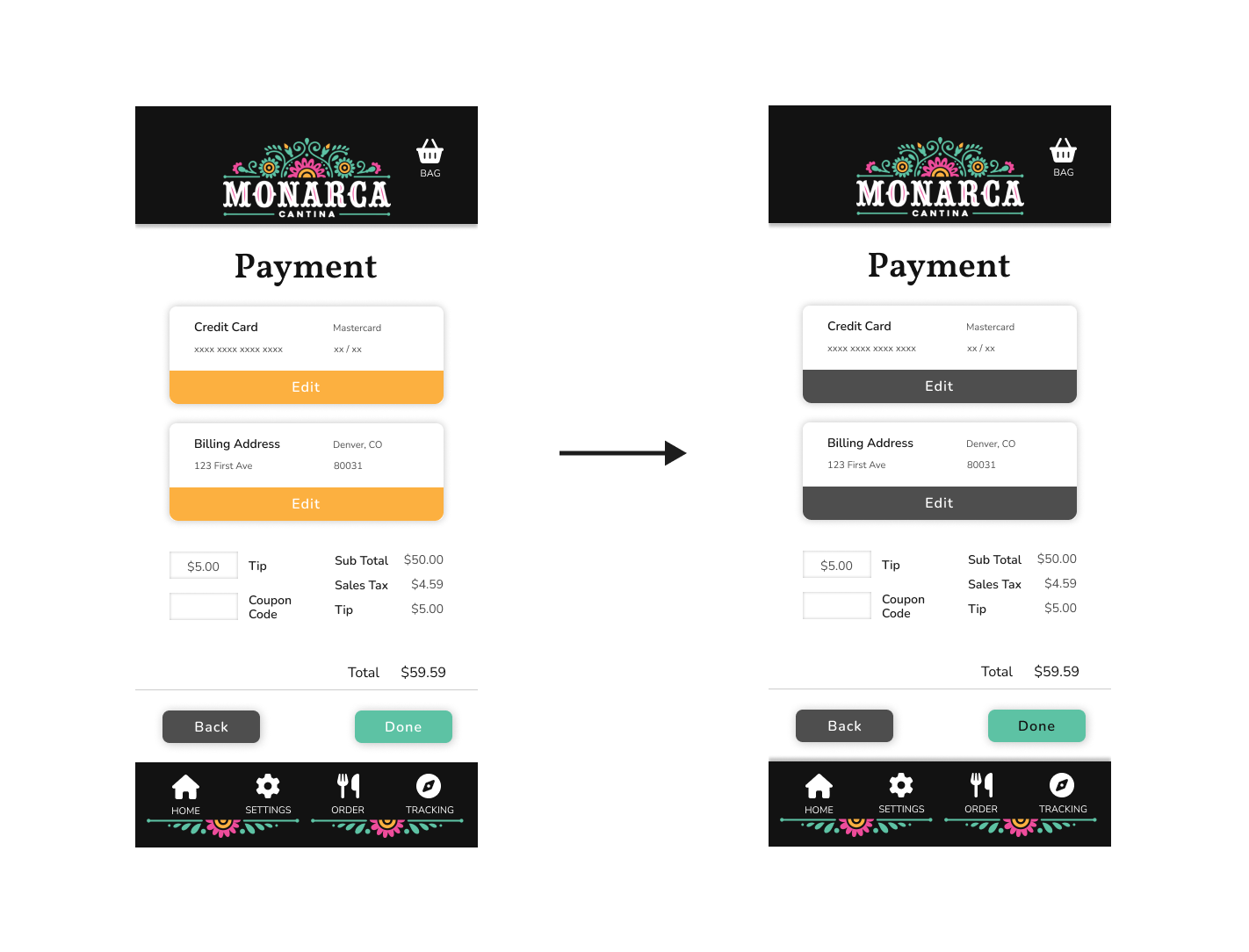
I used the WebAim Contrast Checker tool to ensure all of my text was legible, I found that some of my buttons didn’t have enough contrast and could be hard for some people to read. In the image above, you can see the orange and green buttons made the white text a little difficult to read so I had to make some adjustments.
I also included options for accessibility and language in the settings menu.
Mockups
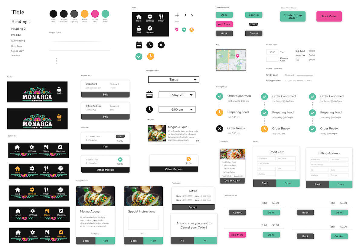
Sticker Sheet
HiFi Prototype
Watch WalkthroughTest Prototype
Sources
Icons - Font Awesome
Images - Unsplash
Logo - Monarca Cantina